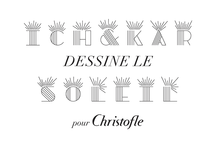
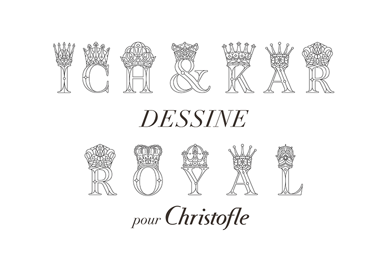
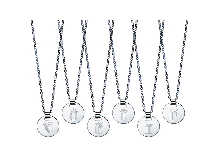
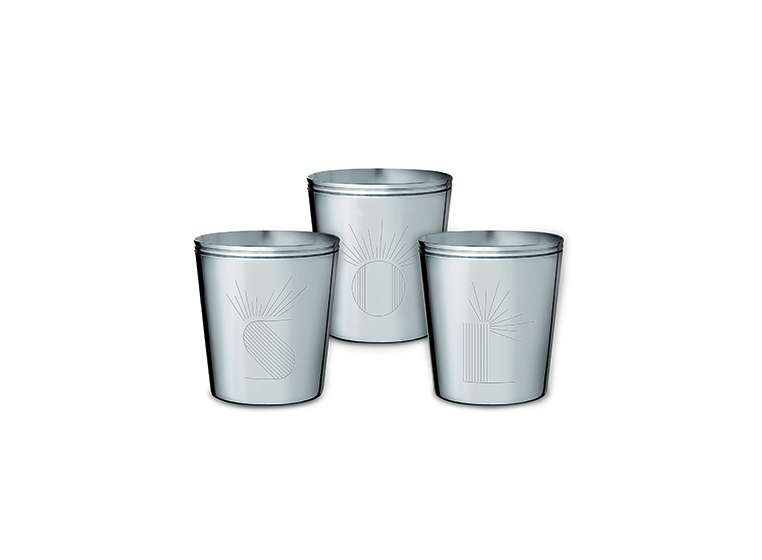
Skip to content
Ich&Kar - graphic designer
  • Contact
  • facebook
  • Instagram
  • linkedin
  • twitter
  • pinterest
  • Ich&Kar (FR)
  • news
  • visual identity
    • restaurants
  • gastronomy edition
  • collaborations
  • space design
  • scenography
  • culture
  • exhibitions
  • design
  • biography
  • press
  • download portfolio
  • personal website

Valérie Henry

vh@valeriehenry.com

visual identity

Christofle’s artistic director asked Ich&Kar to design a series of letters to be engraved on birth cups. The idea was to revamp the style of engraved dropped initials and that of birth cups.
Ich&Kar met the challenge with two collections celebrating the arriving of toddlers.
Hence, Christofle offers to personalize silver medals with the series of letters called « Lettrines Soleil », a tribute to the Sun king, Louis XIV.es Lettrines Soleil.
The other collection of letters is named « Lettrines Royal ». Here are birth cups engraved with this series.
« Lettrines Royal » is seen like a nod to the king child, with crowns orating the letters to show their uniqueness.
The subversive perfume designer État Libre d’Orange entrusted Ich&Kar with the design of its visual identity.
On the occasion, Ich&Kar revisited the original design while playing with the iconic ribbon of Henri Bendel, associated with an illustration, tribute to the famous NY brand.
Tilda Swinton dreamed of a perfume with a hint of ginger, warm and sunny, a cosy one. This fragrance was custom-made for her, inspired by the poem « Like this » written by Rumi.
Fragrance “Delicious Closet Queen” by État Libre d’Orange.
« Rien » État Libre d’Orange fragrance
État Libre d’Orange bottles.
The new creations combine the simplicity of shapes with the shimmering brilliance of the stones.
Like an ode to the colour of its stones, Ich&Kar draws a minimalist and pop press kit.
The black silhouettes wear the jewellery with elegance and modernity.
Chanel Ultra Press Kit
Chanel Jewelry Press Kit
Ich&Kar designed the visual identity of France Design 2012. A three-colored eye resembling a cockade sets the tone to a new design revolution !
Ich&Kar : France Design 2014, Milan.
France Design 2014 – visual identity.
Milk Factory : logo, typography, Ich&Kar based its graphism on gourmandise and curvy pattern, bouncing back and forth from liquid to solid lines.
Milk Factory : postcards.
Milk Factory – Add.
Ich&Kar designed the visual identity of architect Annabel Karim Kassar on the basis of grammar segments inspired by architecture tools, line and angles. AKK inclues straight lines and 45° angles for a reversible monogram. Refined, logic, simple and elegant.
Material and technics used by Ich&Kar are close to that of card printing and editing. The monogram was laser-cut and the card can rotate, reversible as well.
Inside, the documents appear under a cutout folder in embossed Pergamenata. Notebooks are hand sewed and pages are small-squared graph paper.
Ich&Kar designed the visual identity of Blanc Carrare marble contemporary house valuing modernity as much as tradition.
Blanc Carrare is a french marble artisan located in the East of France. For 50 years, they work marble and other natural stones like granit, lava, basalte or onyx.
Blanc Carrare : visual identity.
Ich&Kar designed a playful visual identity for Bazartherapy close to the philosophy of its founders : « A »s are replaced by « ♦ », becoming also the representation of a gift.
Ich&Kar found most of the inspiration in famous sentences specific to shop vendors : «  everything must go », «  find your match » etc…
Bazatherapy – Visual identity
Ich&Kar signed the logo and visual identity of IconicProductCollection, object design studio created by Bénédicte Colpin and Tomas Erel.
Ich&Kar designed the global identity of DesignerBox. Between the logo, the packaging and the website, the world of DesignerBox was meant to pay tribute to each collection and the pleasure of giving.
Chaque boîte est habillée d’un immense numéro dans un caractère qui lui est propre, des illustrations typographiques qui donnent envie d’avoir envie, un esprit léger et énergique…
Louvre Abu Dhabi
Louvre Abu Dhabi
Louvre Abu Dhabi
10 years ago, Ich&Kar designed the visual identity of advertising agency EURO RSCG BABINET ERA TUONG CONG. 11 years later, Rémi Babinet and Stéphane Xiberras entrusted Ich&Kar with the revamping of their identity.
BETC – visual identity.
Ich&Kar signed the new Roger Pradier logo, famous light designer for more than a 100 years.
  • Contact
  • facebook
  • Instagram
  • linkedin
  • twitter
  • pinterest
  • Ich&Kar (FR)
  • Contact
  • facebook
  • Instagram
  • linkedin
  • twitter
  • pinterest
  • Ich&Kar (FR)